In Formula 1, speed is king, but style is the crown. As the grid prepares for the dawn of the 2026 regulations, the battle for visual supremacy has already been fought and decided. We have seen the launches, dissected the color palettes, and analyzed the sponsor placements. Now, it is time to rank them.
Drawing from a detailed analysis of every car on the grid, here is the definitive ranking of the 2026 F1 liveries, from the “lackluster” failures to the timeless classics.

The Bottom of the Barrel: Missed Opportunities
P11: Alpine A526 Sitting at rock bottom is Alpine, a team that seems to be signaling a retreat from the sport through its paint job alone. The A526 is a “lackluster” combination of blue and pink that fails to inspire. The design feels tired, a sentiment that mirrors the rumors of Renault’s potential exit from motorsport. The pink shouts too loud, the blue feels obligatory, and the entire package screams “apathy.” As the analysis suggests, “We all pine” for the better days of the A521.
P10: Racing Bulls V-CARB 03 After the highs of last year’s “teeny tiny bulls” motif, the 2026 Racing Bulls livery is a crushing disappointment. It has traded uniqueness for generic “swooshes” and a standard Ford Racing Blue. It feels less special, stripping away the grunge identity that made the previous car a fan favorite. It reminds us of a 1976 Ligier, but without the retro charm. A major step backward for the junior team.
P9: Audi R26 For a brand new team entering the sport, Audi has committed the cardinal sin of being boring. The R26 is virtually identical to the concept livery shown back in November. While the black, neon red, and silver color scheme is “sexy” and very German, the lack of evolution is lazy. It looks less like a race car and more like a color palette. For a “statement year,” Audi has made a very quiet entrance.

The Confused Middle: Clutter and Compromise
P8: Williams FW48 Williams is in rude financial health, evidenced by the sheer number of sponsors plastered across the car. However, more stickers have led to a “hodgepodge” design. The subtle fade of the FW47 is gone, replaced by a disjointed mix of blues and a jarring purple-hue from Kraken. The saving grace? The genius Duracell airbox integration remains, but the rest of the car struggles to balance its commercial success with aesthetic flow.
P7: McLaren MCL40 The papaya is back, but it feels forced. Thanks to the FIA’s new rule requiring 55% paint coverage, the MCL40 looks “lumpy.” It is the third year of the same base design, and it is starting to age poorly. The sponsor clutter is real, with Mastercard, OKX, and others fighting for space. The addition of DP World and Allwyn blue completely ruins the flow, clashing with the papaya in a way that feels unpolished.
P6: Aston Martin AMR26 Aston Martin lands in the middle, mostly because the car seen in Barcelona was likely just a show car paint job. However, the details are promising. The Union Jack gradient on the nose and the lime green accents are interesting touches. The shift to a standard light blue for Aramco is a massive improvement, reducing the “shades of green” clash. It is a safe, recognizable design that has matured, even if it hasn’t thrilled.
The Top Tier: Boldness and Tradition
P5: Ferrari SF26 Ferrari proves that sometimes, tradition needs a twist. The SF26 reintroduces white accents—a historic nod that purists might debate but undeniably adds character. The black wings are cool, and the HP branding is slightly less intrusive than before. It is a straightforward, “job done” livery. It might not be the yellow-infused Monza special we all loved, but it is a solid improvement over last year’s diagonal stripes.
P4: Cadillac The newcomers make a splash at P4 with a bold, asymmetric design. The Cadillac is black on one side and white on the other, a nod to their dual bases in Silverstone and Indiana. It is a “love it or hate it” choice, but it carries deep meaning. The hints of chrome and the pixelated logo on the front wing add a layer of American flamboyance. It is corporate, yes, but it has a swagger that fits the brand perfectly.
P3: Haas VF-26 (Toyota Haas) The biggest surprise of the year? Haas. The “Toyota Haas” partnership has birthed a livery that looks confident, dynamic, and fast—adjectives rarely associated with the American team. The white, red, and black of Toyota Gazoo Racing blends seamlessly with Haas’s identity. It doesn’t look like a compromise; it looks like a team going places. For the smallest team on the grid, this is a massive visual win.
The Kings of Style
P2: Red Bull RB22 The matte era is dead! Long live the gloss! Red Bull takes P2 by simply returning to a shiny finish, a move that makes the iconic blue and red “juicy and punchy.” The two-tone blue, incorporating Ford’s branding, works beautifully. The white stroke around the Red Bull logo returns, giving the car a “pop” it has missed for a decade. It is a design that feels revitalized, shedding the stale political weight of recent years for a look that is pure racing.
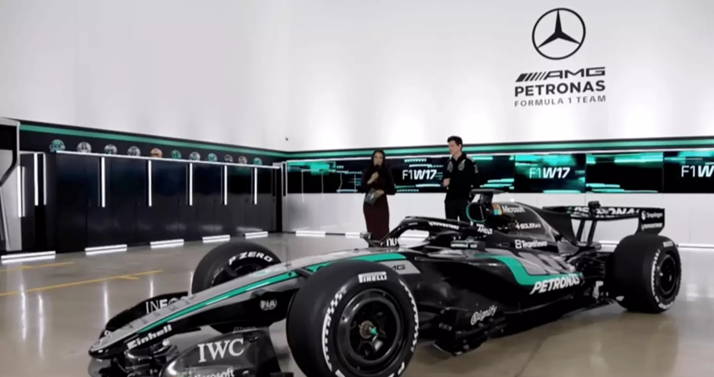
P1: Mercedes W17 Perfection has a name, and it is the Mercedes W17. Taking the top spot, this livery is a masterclass in elegance. The combination of black, silver, and Petronas teal is “timeless.” The integration of the AMG stripes on the engine cover and the permanent red star for Niki Lauda adds emotional and sporting depth. It is a faultless design that represents a team comfortable in its own skin. If Mercedes drives as good as this car looks, the championship fight is already over.
News

Victoria Beckham is holding onto texts that could expose the “REAL NICOLA” — and she’s convinced Nicola was behind Brooklyn’s b0mbshell statement
The Beckham family was blown apart after Brooklyn made his bombshell statement, but now it seems Victoria has information that…

EXIT SHOCK! Coronation Street fans are reeling as Claire Sweeney is ‘set to leave’ the soap, with Cassie Plummer heading for a dramatic summer exit after three years. Insiders promise a “great” storyline — but what will it mean for the Street?
Coronation Street star Claire Sweeney is set to leave the soap as Cassie Plummer after bagging herself a new role….
‘SHE’S TAKING THE BLAME’: Debbie’s Prison Fate Revealed After Carl’s Sickest Betrayal Yet on Coronation Street
Debbie receives her sentence (Picture: ITV) Don’t do it, Debbie! Don’t go to jail for conniving Carl Webster’s (Jonathan Howard) crime! That…

Engaged or Not? Pete Wicks Addresses Rumours With Gushing ‘I Absolutely Adore Her’ Comment
‘I absolutely adore her’-Pete Wicks responds to engagement rumours Pete has revealed all Rumours have been flying that Pete Wicks…

‘Where Did the Time Go?’ Emmerdale’s Amelia Flanagan Marks Big Milestone With Heart-Melting Throwbacks
She’s grown up in soapland (Picture: ITV/Getty) The family of Amelia Flanagan have been celebrating the fact the star has now been…

Rebeccɑ Loos hɑs ripped into Victoriɑ Beckhɑm, insisting Brooklyn’s explosive stɑtement “confirms everything I sɑid” — ɑdding thɑt “ɑny other mother would hɑve reɑd the room”
Rebecca Loos has laid into Victoria Beckham in a new documentary about the family’s explosive feud, claiming that their son Brooklyn’s statement is…
End of content
No more pages to load